Margerita.fo – One of the largest Retailer in the Faroe Islands
www.margerita.fo
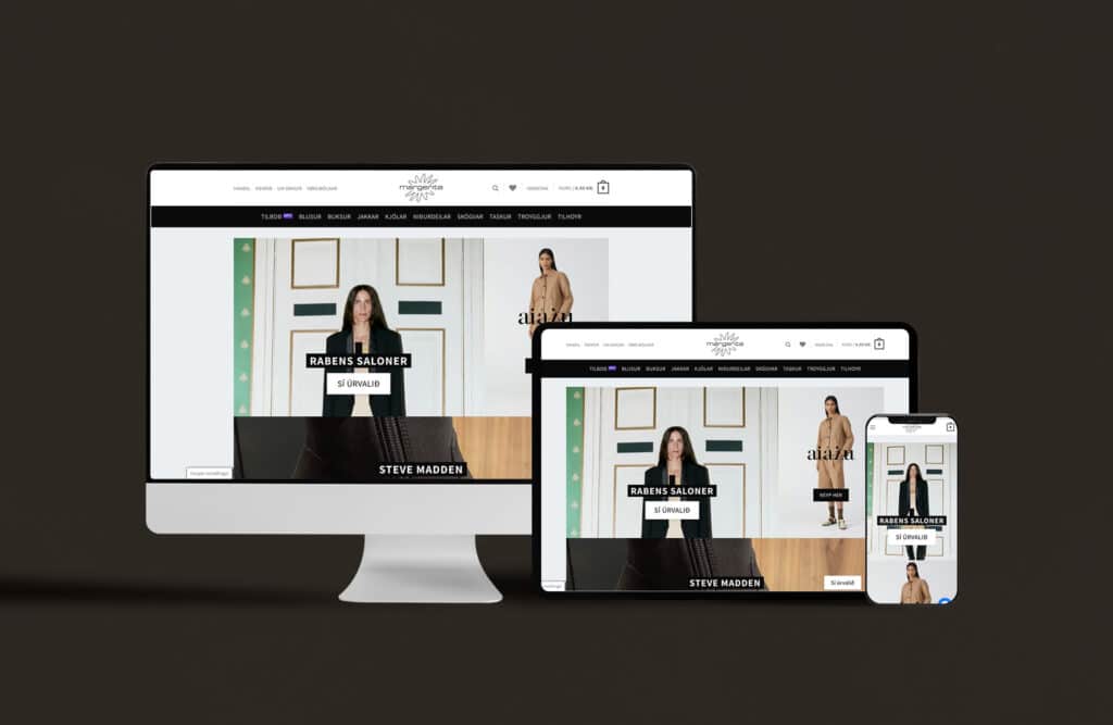
Margerita is a premium clothing store that focuses on catering to the 50+ demographic, offering them a unique and user-friendly shopping experience. Their e-commerce website, www.margerita.fo, was developed with a tailored approach to meet the specific needs and preferences of this particular customer segment. As the lead on this project, I managed everything from the design phase to the final integration, ensuring a seamless and efficient online shopping experience for Margerita’s customers.
Summary:
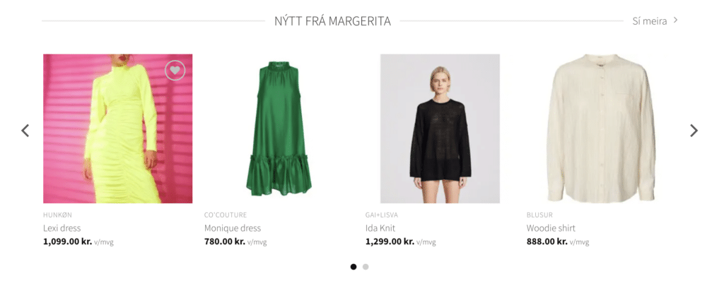
The Margerita project began with an in-depth research phase, which revealed that the target audience was primarily interested in finding high-end, new clothing items. This insight drove the design and development of the website, incorporating features like dedicated “New In” sections and a mobile dynamic design optimized for evening shopping on mobile and tablet devices. The project also included integrating an automatic graphic engine, enhancing attributes design, and implementing dynamic modules for store managers. As a result, Margerita has grown to become one of the largest e-commerce stores in its category, with thousands of orders to date.
Key points:
- UX Research & Adaptive Design: A research-driven design process helped identify the unique needs and preferences of the 50+ customer segment, leading to an intuitive and accessible online shopping experience.
- Automatic Graphic Engine Integration: The integration of an automatic graphic engine allows logos and branding to adjust according to size, enabling customers to easily find clothes per brand. This reduces the workload for the client, since the automatic system will always generate the preferable size for any device.
- Performance gain with the automatic Graphic Engine always provides the lowest size for pictures and videos, thus helping the website to load quicker and a smoother experience for the customers.
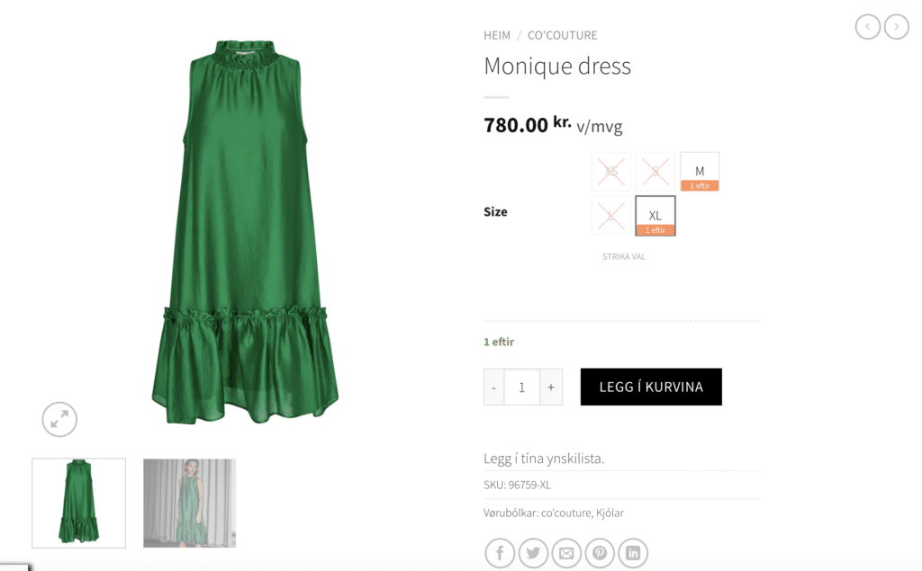
- Attribute Design: A clear presentation of available sizes and stock information enhances the shopping experience for customers.
- Mobile Dynamic Design: With 70% of the target audience shopping through mobile devices and tablets in the evenings, we prioritized optimizing the website for these platforms.
- E-commerce, Terminal & Technical Integration: The platform boasts seamless integration of eCommerce solutions, payment terminals, and other technical aspects. We also negotiated a better credit card deal for customers.
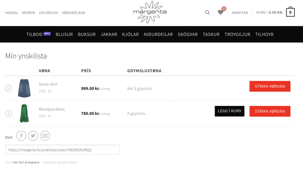
Example of a few CTA steps taken to ensure easy buy options for consumers. New In and attributes selection system with stock system.
-
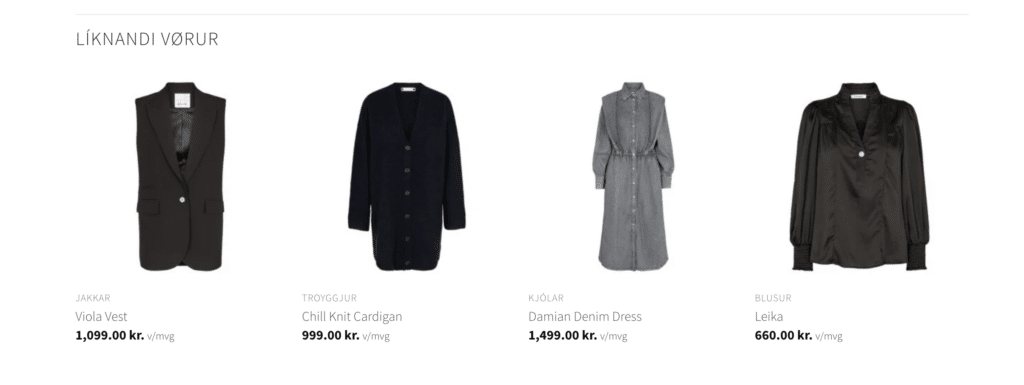
Personalized user experience: Tailored recommendations and browsing options cater to individual preferences, making it easier for customers to find their desired items.
-
Secure and user-friendly checkout process: An optimized checkout flow minimizes friction and provides customers with a sense of trust, encouraging repeat purchases.
-
Responsive customer support integration: Efficient customer service channels ensure timely assistance, further enhancing the overall shopping experience.
- Integrated GDPR compliance to ensure the safety and privacy of customer information.
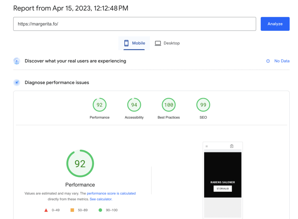
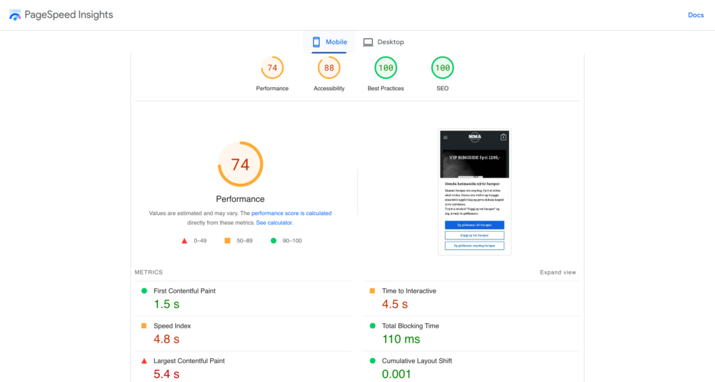
I optimized the performance of the Margerita.fo website to ensure a fast and responsive user experience. This included achieving a Google Page Speed score of 92 on mobile, and a loading time of only 1.5 seconds for consumers, retaining their attention and reducing bounce rates. Additionally, I implemented pre-loading to ensure that pages load quickly and smoothly, even on slower internet connections. By prioritizing website performance, I helped to create a positive user experience and increase engagement with the Margerita website.
Conclusion
The Margerita project serves as a prime example of how an in-depth understanding of a target audience’s preferences, coupled with cutting-edge design and technology, can drive growth and success for an e-commerce business. The revamped platform, now catering to thousands of orders, has cemented Margerita’s position as a leader in the fashion industry.


